Task #9
Network Assignment
Last week’s task #8: Golden Record Curation involved curating 27 original music pieces from the Voyager Mission down to 10 pieces, each member of the cohort using our own specific and unique criteria. The Data from our curations was taken and grouped to display a social network from our commonalities in several visualizations.
So,
What did these visualizations show -- and not show about our cohort's social network ????
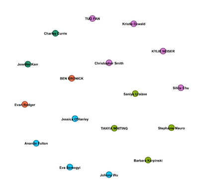
Visualization 1
This visualization was a great place to start as it’s not yet a complete network graph. It shows every node (person) in our cohort; all the same size and weighting but without much detail about the relationships within the visualization. The only indication of relationships is by colour groupings to represent individuals we can assume had the same musical choices for the Golden Record Curation.
I seem to fall within the blue group of four. Go Team Blue !!!
The first impulse is to think that we are a like-minded group of people, after all, we picked a very similar list of musical tracks. However, when looking at our criteria for the musical curation we aren’t alike at all. I just wanted a variety of instruments and sounds, Jessica’s criteria were her emotional responses to the music, while Ana’s criteria involved diversity and not enforcing current power structures. Johnny’s was the most creative and out of the box criteria, picking forceful music to send a message ‘don’t mess with us on Earth’
Not so alike after all. However, I still say...
Go Team Blue!
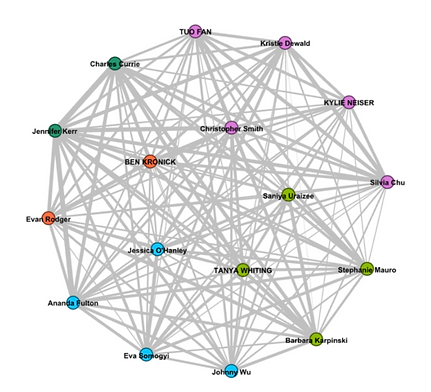
Visualization 2
This visualization has the edges (vertices) added to the network graph showing the relationships between all the nodes. This is an undirected graph where the edges have no direction or orientation, and the nodes are unordered pairs. The only thing we can infer from the edges is the strength of the relationship, in this case, the similarities of music pieces chosen.
One interesting observation is that the strength of some relationships in the blue group are not as strong as they are with some of the other nodes that aren’t in the same colour group. For example, Ana’s connection with Jennifer (green) is much stronger than any of her connections within our blue group. Also, her connection with Charles is as strong as any of her connections within the blue group. Hmmm, she may be a spy from the green group. Again, Evan’s connection to Jennifer and Ana is just as strong as her connection to Ben. It makes me want to dig deeper into the algorithm that created the network graph, what criteria were used to create the groups.
Finally, I would have expected that with 17 nodes in the graph each node would have 16 connections. In looking at mine there were 16 connections (social anxiety relieved, whew). However, there are a couple that only have 14 edges, that would/could mean that they had lists that were shared no commonalities with 2 nodes. However, this could be my aging eyes as I was unable to follow and identify two nodes that weren’t connected. Logically it could happen and I really wanted to see if the inclusion/exclusion criteria were vastly different between two nodes. Again leading to curiosity about the algorithm and its criteria for matching.
Visualization 3
This last visualization is also an undirected graph but with ordered pairs, each edge connects a person with a musical selection. The size each musical selection node shows how frequently it was selected for inclusion in the 10 that would go on the Golden Record. It’s tempting to theorize why some music pieces were selected more than others. The most popular selection was India, raga, "Jaat Kahan Ho," sung by Surshri Kesar Bai Kerkar. 3:30. However, when looking at the criteria used to select this musical piece there was a lot of variation. I picked it because the sitar was a different instrument from all other music, others for the emotionality of the piece, still others for its cultural diversity.
Another interesting note is that there were 27 selections to choose from, however, this network graph shows only 25 of the selections. Two musical pieces were not chosen by anyone; the Men’s house song - Papua New Guinea. I had no success in looking for reasons these weren’t chosen, many of us did not list exclusion criteria for our selections. The important thing to note is that some data can be left off the network graph and possibly result in the loss of important information or relationships that are not seen.

Reflections
This was a great exercise in exploring the high degree of abstraction in Network Graphs, and possibly Network Theory. I found myself prying and trying to pick apart each visualization in search of more information and some sort of meaning.
This could be due in part to the small amount of data used, or to the type of data used. For example, imagine if instead of the end result as data we had each submitted our top 3 criteria for inclusion and our top 3 reasons for exclusion. Would we have found a more solid commonality amongst the groups? We can all say we are a like-minded group, after all, we are mostly teachers, UBC students, Grad students, MET students. However even as an ETEC 540 group, we have wide variations among us. There needs to be a lot of thought put into how what and even when data is gathered.
There must also be a lot of thought put into the algorithms used for the creation of Network Graphs. Visualization 2 left me with many questions regarding how the groups were put together when in places some strong bonds seemed ignored in favour of other slightly lighter relationships.
Visualization 3 spoke to the possible missing data, nodes missing due to weak or non-existent bonds that could still be a wealth of information.
In thinking about the future of Network Theory and Network Graphs so many concerns need to be considered and cautions given.
The one thought that kept popping to into my head from past experience in research work was ‘correlation does not imply causation’
Going back to my Blue Group in the visualizations (best group ever). A semi Real-World example. Perhaps all of my group clicked on an article/picture of David Bowie. Jessica may have may have an interest in his music, Ana because of his film career, Johnny sees him as an alien that needs watching, while I may see him as my fantasy rock star boyfriend. All of us with an interest but for greatly different reasons.
The future is already here, data is gathered, we’re grouped together and next thing you know we are all receiving updates, sales offers, etc.
A silly example that explains the strange things that show up in my news feed, the interesting amazon shopping suggestions, Netflix recommendations. It gives me more to think about networks and algorithms and where we may be going next…..